

What takes a B2B website design from good to incredible?
Conversion optimization! Because your website is likely to be the first impression a prospect has of your brand, it’s important to have a site that is optimized to drive leads through the funnel by following website design best practices.
Check out these 4 examples of B2B website designs that feature intuitive website navigation, persona-driven architecture and clear conversion paths — made entirely with the user experience in mind.
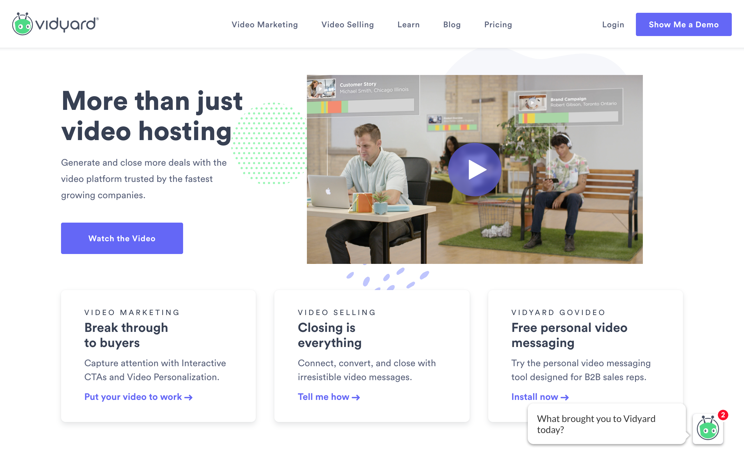
1. Vidyard
Vidyard uses website navigation best practices to optimize for conversion.
Each navigation category is easy to understand and features clear naming conventions that are free of jargon. Their navigation hierarchy is intuitive and logical, and it features an opportunity to convert through a bottom of the funnel opportunity. Plus, it’s sticky — meaning that no matter where their visitor scrolls, the navigation menu will follow!
These navigation best practices will help ensure that your visitors are able to find the information they need quickly while keeping in mind that they may be in different stages of the buyer journey.
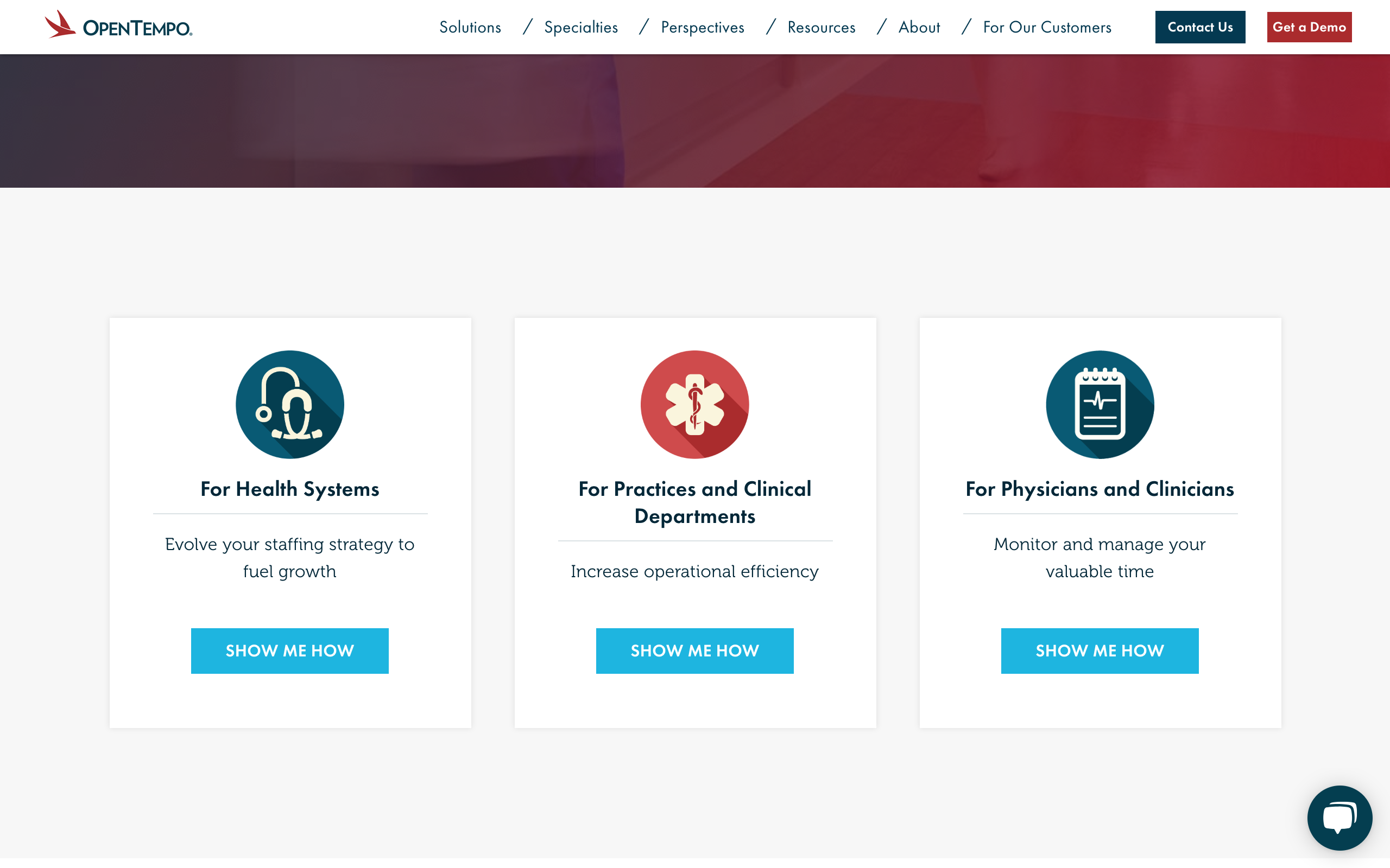
2. OpenTempo
OpenTempo optimizes conversion through persona-driven architecture.
Here’s what we mean by persona-driven architecture: OpenTempo’s website allows visitors to self-segment and easily find content that they are looking for. This helps drive conversion by guiding visitors to relevant content that they’re more likely to convert on.
These personas should be determined before you begin designing your website. By taking the time to develop your personas, you will have a better understanding of what each persona values and how that can be translated onto your website. Tailoring content to personas is a driving force of inbound marketing — keep this in mind when you create your architecture and outline your conversion paths.
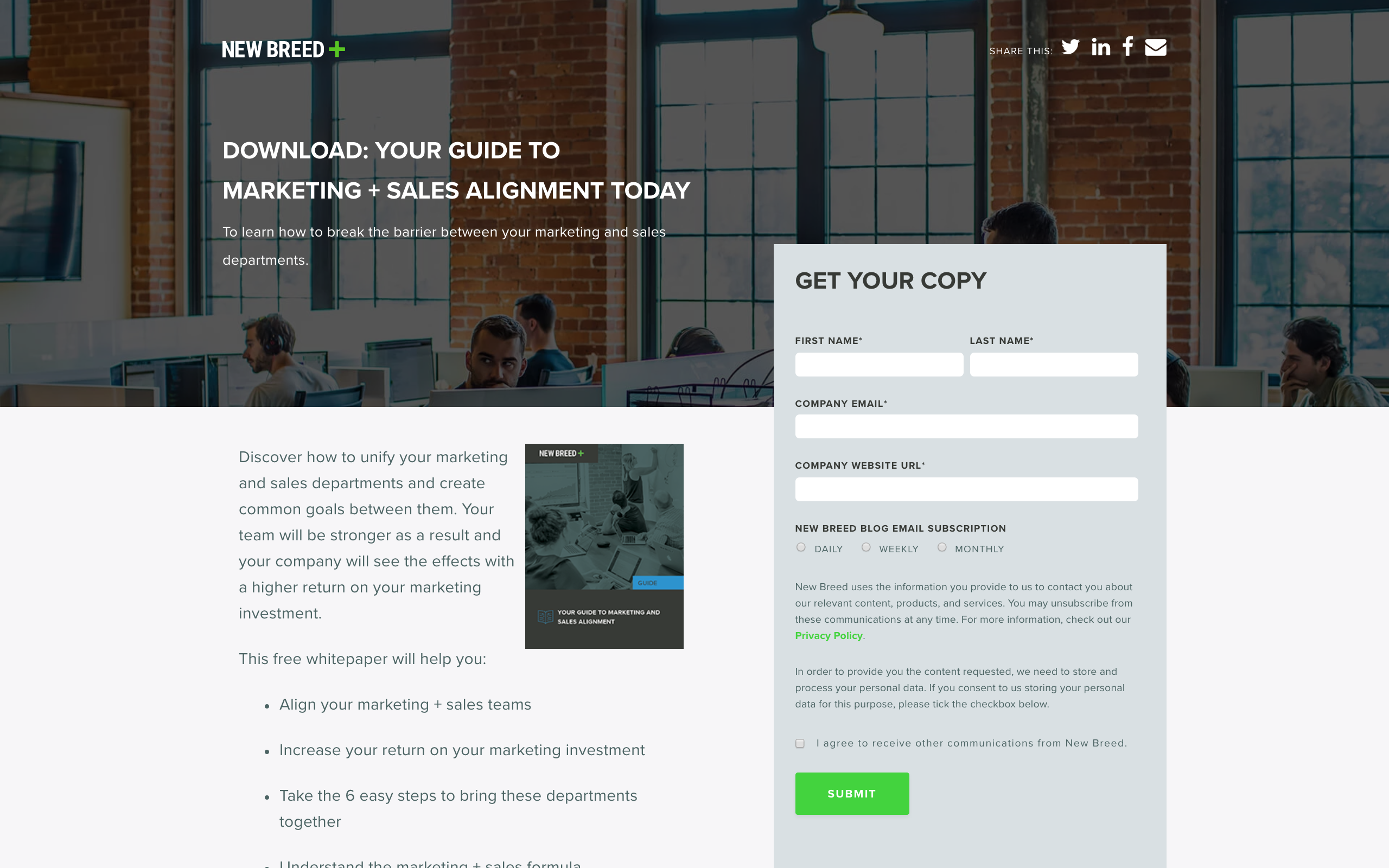
 3. New Breed
Here at New Breed, we’re proud of the website we’ve created and the vast number of opportunities we provide for conversion. By having optimized conversion paths, we’re able to push someone through the funnel by pairing content to where they are in the buyer’s journey.
For example, when a visitor finishes reading a blog, they have the opportunity to convert through a related visual call-to-action. By clicking the call-to-action, they are brought to a landing page optimized for conversion and pushed into converting to the next step in the buyer’s journey.
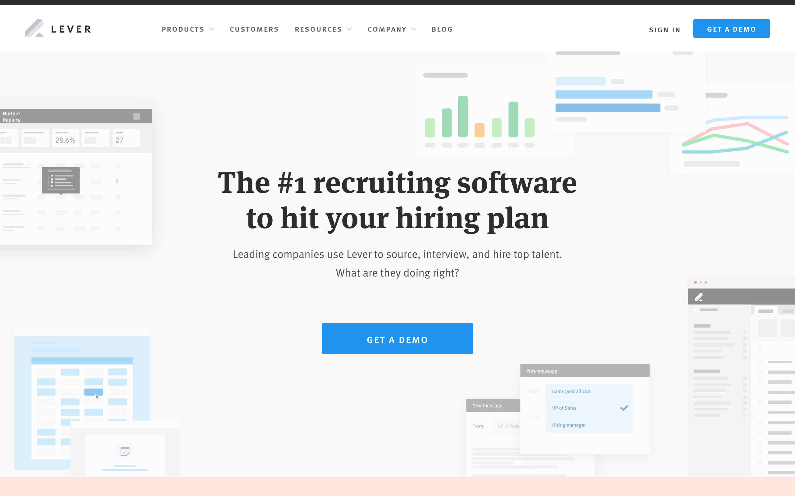
4. Lever
Lever was designed with user experience (UX) in mind. Coupled with best practices, Lever leverages their user experience to help drive conversion.
By designing a site with user experience in mind, Lever ensures that all visitors are left with a positive impression of their company. Their design is clean and well laid-out, promoting aesthetics and usability. Any images are also coupled with alt text ensuring their site is ADA accessible. Their color usage is visually pleasing and their color combinations have enough contrast for people with bad vision.
The Takeaway
Keep these 4 B2B website design examples in mind when creating your site; their innovative use of best practices makes their websites truly stand out — and standing out is the first step to attracting customers away from the competition.
Consider leveraging best practices for user experience, conversion paths, persona-driven architecture and website navigation. This will drive lead generation and promote conversion down the funnel. Ultimately, a best-in-class website will help you close the deal.

Tag(s):
Websites