

Not everyone who can benefit from your product is aware they have a problem that needs solving. If they don’t know they have a problem, they’re not searching for solutions online. You can’t rely on this high-fit but unaware audience to come to you. Instead, you need to meet them where they’re at.
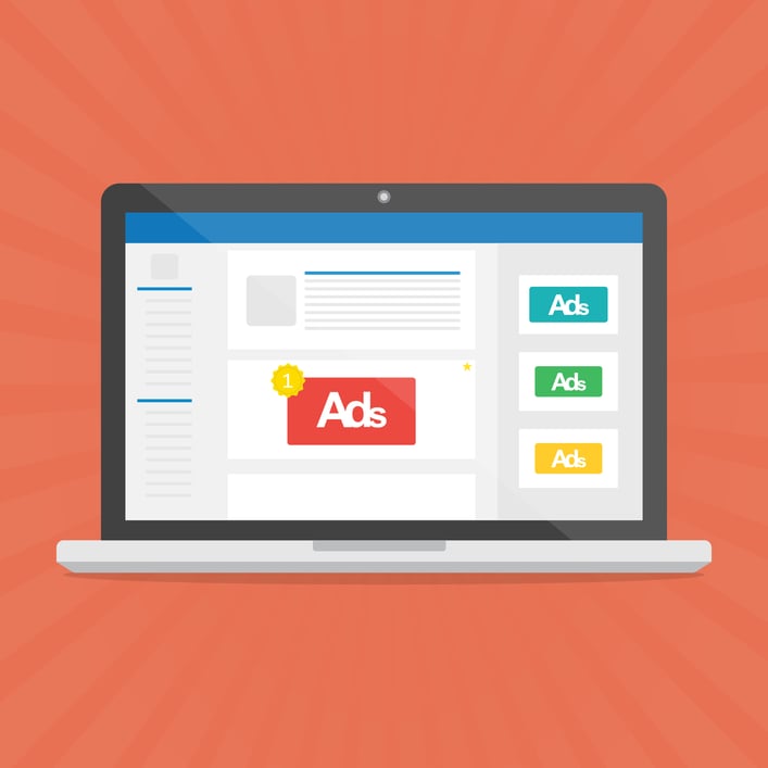
Placing display ads on the sites frequented by your target audience is one way to attract those people to your site. Once they arrive on your website, you can help them fully understand their problem and educate them on potential solutions.
However, since people aren’t going to websites looking for display ads, your display ad has to catch their attention and entice them to click. Here are five tips for designing display ads that’ll will make an impression:
1. Think of Restrictions as Opportunities
“Google display ads are inherently challenging because the sizes and proportions can be pretty intense,” says Nick Frigo, a Growth Strategist at New Breed.
For example, short, wide banner ads that stretch across the top of a website are basically six times as wide as they are tall. Creating attractive ads for irregular shapes like that can be difficult for designers used to working in more standard dimensions.
“When you depart from those norms, designing things gets a little harder and people aren’t sure where to put certain features,” Nick says.
A common mistake is attempting to fight the unique proportions, trying to cram the same content into a narrow rectangle as you would a square.
“But this is actually an exciting opportunity for designers,” Nick says. “I think in general when you’re being creative, any restrictions placed on your design are opportunities to have fun and achieve your goal more creatively."
Embrace the weirdness of the ad dimensions as a chance to create something that wouldn’t work elsewhere.

2. Consider How Your Narrative is Experienced

When people look at an ad, they scan and process all the information they’re presented within a matter of seconds. The way elements are positioned changes how the ad is experienced.
“The order in which you tell a story in an ad is important, just like when you write. You can actually tell a linear story visually,” Nick says.
For example, if readers’ native language reads from left to right, they’re going to read your ad that way too.
If you want to present a problem and then the solution your company provides in a clear, linear way, you’d want the problem to be the left-most piece of content followed by the solution and your logo. If you do the opposite, by starting with your logo, followed by the solution and then the problem, you create a different experience that might not resonate as strongly.
That reading pattern can also impact non-narrative content.
“Because we read left to right, top to bottom, your eyes are a little more sensitive to visual content the earlier you see it,” Nick says.


For example, if you’re designing a square ad, the top right diagonal half has a more intense impact than the bottom left diagonal half. That intensity can be used to highlight specific elements depending on the goal of the ad.
“The designer can control the narrative based on how they organize the story in the ad,” Nick says.
3. Follow the Fundamentals of Graphic Design
Keep design principles like balance, the rule of thirds and the grid system in mind as you’re designing your ads.
“You have to think about when you want to use symmetry and when you want to use asymmetry,” Nick says. “Usually the answer is to be asymmetrical. People are reading things so fast online that if you have an ad that splits itself in half, it’s going to draw attention away from it because that stuff is hard for our eyes to look at.”
Making design decisions informed by these principles can help direct viewers’ attention to the portions of the ad you want to emphasize and keep them looking at your ad longer.
4. Less is More for Copy
Ads are short, attention-grabbing snippets — they’re not an entire novel. If your display ad is too text-heavy, viewers will get overwhelmed and skip over it.
“You’re not trying to outline your entire value proposition in one display ad,” Nick says. “You’re trying to generate interest in the subject matter or resonate with a very specific pain point or challenge someone has.”
It may seem like boiling down your entire company to a single feature, product or service does your company a disservice; however, it’s better than trying to include it all in a single ad. Once someone decides to click on your link, they can learn about the complexities of your company on your website. But, if they’re not compelled to click on your ad, they’ll never get there.
A display ad is not the place to tell a multi-chapter story, but rather a snippet that intrigues viewers into wanting to read more.
5. Stand Out with Bold, Saturated Colors

Your company should have a variety of colors in your brand style guide, some of which are more neutral colors and others which are vibrant. Typically, your neutral colors will be used more heavily, with the bolder colors only serving as an emphasis element. When designing display ads, you can reverse that mindset.
“Display ads are a really good time to use the boldest color in your arsenal,” Nick says.
You can even overuse your bright colors as long as the ad still aligns with your brand.
In addition to using bold colors to stand out, avoid using white as a background color. The sidebars where display ads are placed are typically white, so a white background can cause your ads to blend in and be overlooked.
Takeaway
Display ads are meant to entice viewers to click. To do that, they can’t be bland.
“The ads that always resonate with me are just fun,” Nick says. “Don’t be uptight. It’s supposed to be interesting, and interesting things and are always pushing a boundary of some kind.”
Display ads are opportunities for designers to do something different. Be creative and develop display ads that will engage your target audience — even if they don’t yet know they’re interested.

Tag(s):
Demand Generation