


Website Redesign | Step Four
Design and
Design and
development
Many people enter website redesign projects leaping straight into design and development. The work you’ve done up until this point is fundamental to ensuring the time you invest in this phase is effective and that your site accomplishes the goals you set in the beginning.
Design system
Your design system is a collection of elements and components that assemble the look and feel of your website. These can be colors, buttons, link stylings and other user interface elements.
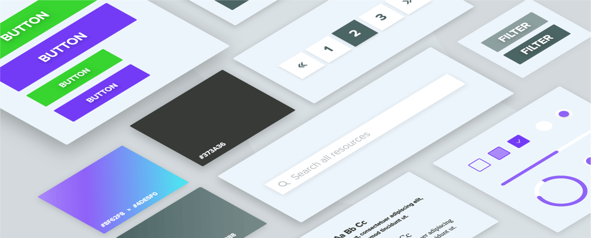
Your design system will set the standard for components that appear in multiple locations across your website. If a button looks one way in your design system, it should look that way across your entire website. Creating a cohesive design system and sticking to it is essential to creating a good user experience.
Your design system won’t include every visual element on your website, but the elements included within it should inform your design as you build out your modules.
Design for the brand you want
When it comes to creating your design system, it’s essential to design elements that are not only visually appealing but also align with your brand. What does the visual aesthetic you create say about your business? What message does it convey?
Bright colors and smooth corners are trendy and portray an air of casual playfulness, but is that aligned with how you want your brand to be perceived in the market?
A website redesign project commonly accompanies brand refreshes or revisiting your brand’s core messaging. The copywriting and design work associated with your redesign project can help you weave in any revised messaging and brand visuals into your business’ most front-facing tool: your website. You should finalize the foundational work of your brand refresh prior to starting your website redesign project, but continue to design your new website with your aspirational brand in mind.
Prioritize the user experience
While not the only factor, front-end design can play a significant role in your website’s user experience. Your design should support your users by making it simple to find the content they need.
That can mean condensing dense content into easily digestible graphics, clearly defining clickable elements, using tertiary visuals to guide viewers down a page and any other number of visual cues.
If something looks good but is difficult to read or interact with, then you’re doing your users a disservice.
Modular development
The best websites are in a constant state of improvement. Developing static page templates can be prohibitive in the long term, as they’re more challenging to edit without impacting multiple pages.
Instead, modern websites are trending in the direction of module-based design. This means every block on a page is interchangeable and can be moved anywhere on the page. Building out pages with modules helps your marketing team edit pages in the future and even build new pages without needing a developer’s assistance.
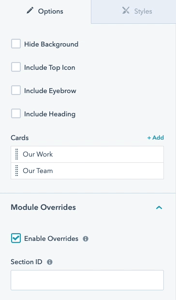
Designing modules
If you decide to build your pages using modules instead of templates, it’s important to consider the many different formats in which a module could appear. Certain pages have the module appearing at the bottom of a page, while others have it appearing at the top or between other modules with unique designs.
In any case, your module needs to be flexible enough to look appealing and cohesive no matter where it appears on a page. Developers can accomplish this by implementing options to enable editors to modify certain module elements, like background, margins and padding.
Quality assurance
Not long ago, blogs, thought-leadership pieces and guides like this one stressed the value of responsive design and mobile friendliness. No longer. At this point, such factors are table stakes.
As you dive deeper and deeper into the design process and your website starts to come together, the temptation to press the big red “launch” button will only grow. You must fight this urge.
Prioritizing quality assurance and making sure your website looks and behaves the way you want it to across devices and viewports is essential to crafting a great user experience. If a user opens your website in Firefox and sees broken elements or a different color than a Chrome user, you’re creating an inconsistent experience.
That’s why you should dedicate time in the design and development phase to check modules and site pages through multiple viewports and mobile devices.

Mobile friendliness
Like we said, you shouldn’t just be considering whether your website is mobile friendly; you should be prioritizing it. That said, it’s important (once again) to consider your users. If your website data suggests that most of your traffic comes from mobile devices, then your website shouldn’t just look good on mobile, it should be designed with a mobile-first mentality.
Quality checking mobile friendliness doesn’t need to involve opening up every site page on your phone. Instead, you can leverage tools like Google Chrome’s Inspect function to change the viewport of your current window into one of the mobile devices you’re testing for.

Browsers and responsiveness
Similar to how you would test your website’s mobile friendliness, you should also validate your website’s responsiveness and display across multiple browsers. That means opening up your website pages in Firefox, Chrome and Safari and creating lists of anything that may need to be addressed by developers.
Additionally, while those browsers are the most common and own a significant share of the market, it’s important to confirm with your website data whether or not there are any uncommon browsers or devices you will need to check your website’s quality in.