

Your website serves multiple purposes for your business but, likely, the most important function it serves is enabling end users to get in touch with you. Users are hungry for this information, as 51% of people think “thorough contact information” is the most important element missing from many company websites.
Users should find it easy to contact your business based on their needs, for example:
- Prospect: Interest in learning more about your product or services
- Customer: Question on how to leverage your product or services
- Job Applicant: Searching for a role that fits their skillset
Your Contact Us page should not be the only destination for a user to get in touch, but it should be the most comprehensive option for a user to reach out if they didn’t successfully navigate to a more specific landing page such as a BOFU content offer or support center.
What makes a great Contact Us page?
If a user navigates to your Contact Us page, their goal is to get in touch with a member of your company who can help them solve a problem or answer a question. Here is a quick reference to making a high-CRO landing page:
- Don’t overcomplicate it. If your page is serving any other purpose than getting a user in touch with the right person at your company, you’ve gone too far.
- Provide multiple routes for contacting based on user type. The options you provide should be based on common inquiry paths such as sales, customer support, news inquiries, etc.
- Include a variety of options for contacting your business. Users have different preferences based on their needs. Include a contact form, phone number, chatbot, and email address so folks can self-select the communication style that works best.
- Leverage internal linking. Users default to the Contact Us page if they’re unable to navigate to the page that they’re looking for. Include common pages such as an FAQ, careers, demo, support, links to social channels, and product overview pages to help users select the best next step.
- Include social proof. Consider what external validation will be the most useful for a user to see when they’ve navigated to the contact page.
-
If they’ve self-selected to contact sales, consider displaying customer logos or statistics that bolster your position in the market.
-
If they’ve self-selected to contact support, consider displaying statistics that validate your support infrastructure to build trust before they reach out.
-
Why do many Contact pages look outdated compared to the rest of the website?
Contact pages often end up looking outdated compared to the rest of a website because website designers tend to underestimate the importance of these pages in terms of both copywriting and design. They often prioritize other aspects of the website and leave contact pages at the bottom of their priority list.
As a result, contact pages can end up resembling websites from the 1990s, while the rest of the website showcases a modern and updated design. This neglect of contact pages may stem from a lack of recognition regarding their significance in facilitating communication between the website and its visitors. That's why it's crucial to prioritize the design and copywriting of contact pages to maintain a cohesive and visually appealing website experience for users.
How can you incorporate your brand identity into the contact page without cluttering the content?
To create a seamless user experience and ensure easy navigation, incorporate your brand identity into the contact page through a minimalist and clean design. You can achieve this by utilizing consistent branding elements like colors, fonts, and imagery. By subtly integrating your brand identity into the contact page, users can quickly find the information they are seeking while experiencing a visually cohesive design.
What additional resources can you provide on the Contact Page to help users find answers to their questions?
To help users find answers to their questions, you can link to a knowledge base. This allows users to quickly and easily access relevant information without having to wait for a response. By offering a knowledge base or a community of other customers who can answer questions, you can empower users to find solutions on their own.
13 Contact Us Page Examples
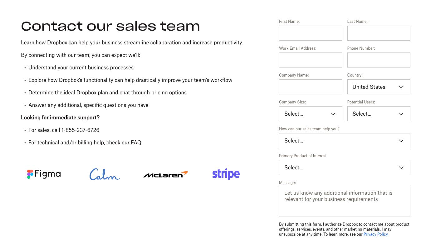
Dropbox
Dropbox’s Contact Us information architecture makes it incredibly easy for users to find the contact page and they take it one step further by giving users the option to reach out to sales directly in the navigation.

Once a user lands on the Contact Sales page, they are once again offered multiple options (phone number, find a partner near you, visit help center) on how they’d like to proceed depending on their need.
Mailchimp
Mailchimp’s Contact Us page masters the art of simplicity. The page gives the user the option to select a topic that routes them to the right page or follow-up questions to support them.
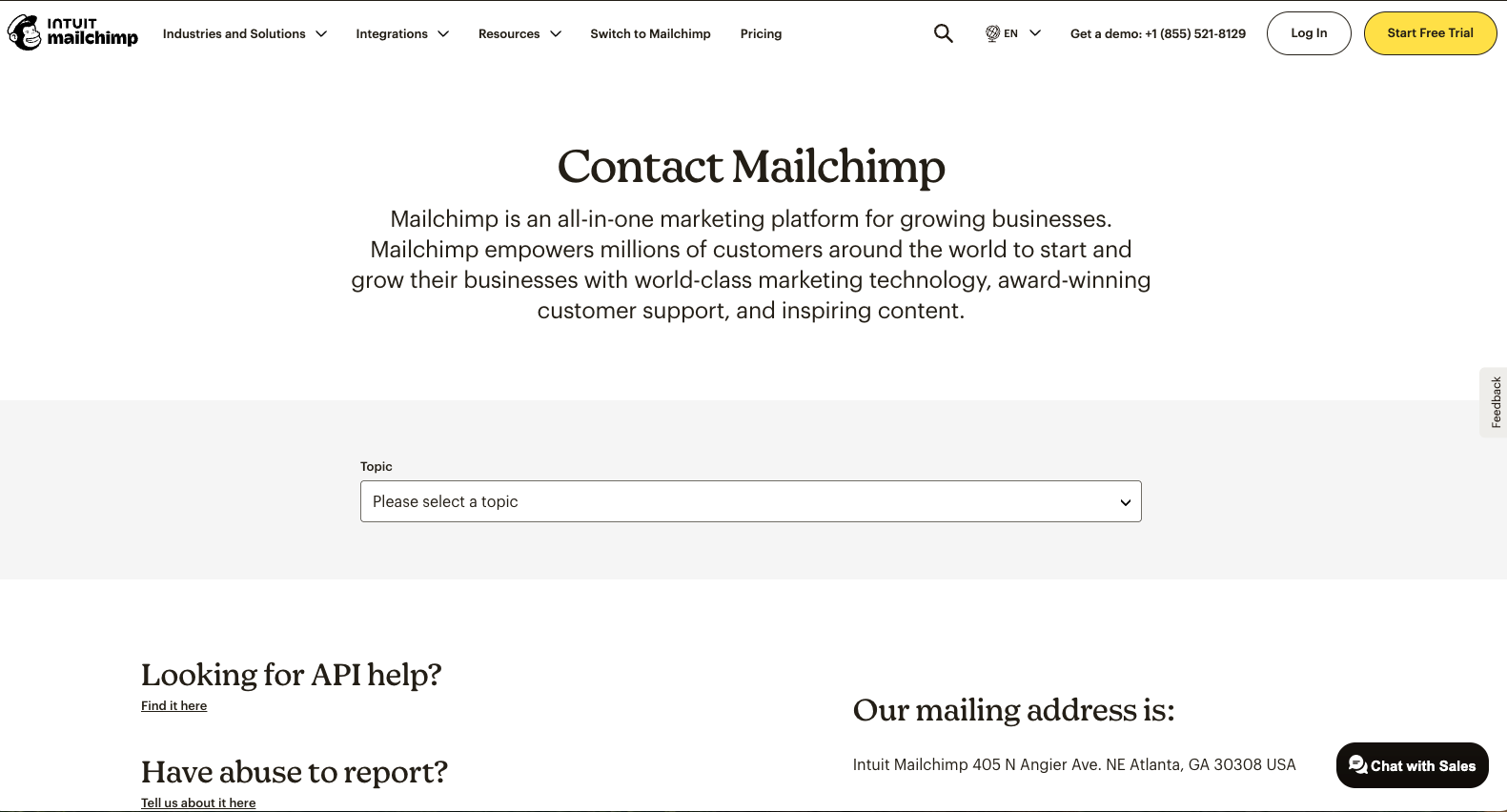
The page provides a succinct summary of Mailchimp, its mailing address, and quick links based on commonly-requested content from users. Mailchimp also includes a brief section outlining its acquisition by Intuit and key links for the parent company (website and corporate contact page). 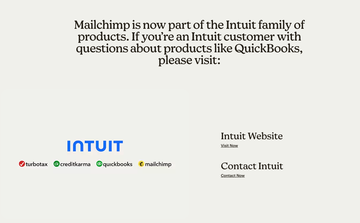
Typeform
People spend 1.4x more time on pages with video than without. Typeform took that statistic to heart when building their contact page. Typeform’s modern approach to the contact page includes a 7-second video that encourages users to select the next step that’s most applicable to them.
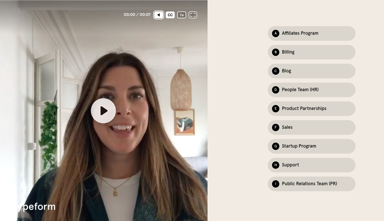
All of the options redirect a user to a destination page with more information on the topic selected. Most of the subsequent pages leverage Typeform's stylish forms, which is a clever way to showcase the product in the website user’s experience.
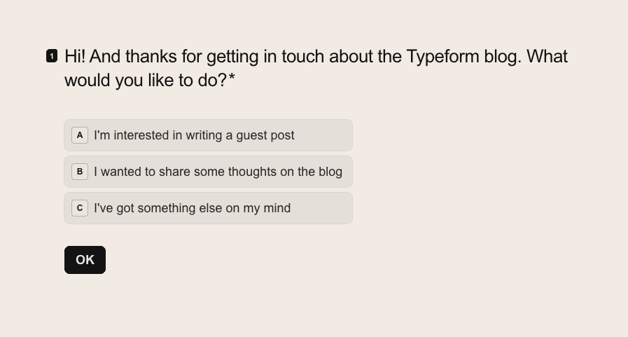
The downside to this modern approach is that it’s difficult to navigate back to the parent contact page and there is no option to select “other” if your inquiry doesn’t apply to the list provided.
ZenDesk
ZenDesk does an awesome job of threading its brand identity into the Contact Us page without cluttering the content so users can still quickly find what they’re looking for. It takes users about 0.05 seconds (yes, you read that right) for users to form an opinion about your website that determines whether they like it or not and first impressions are 94% design-related.
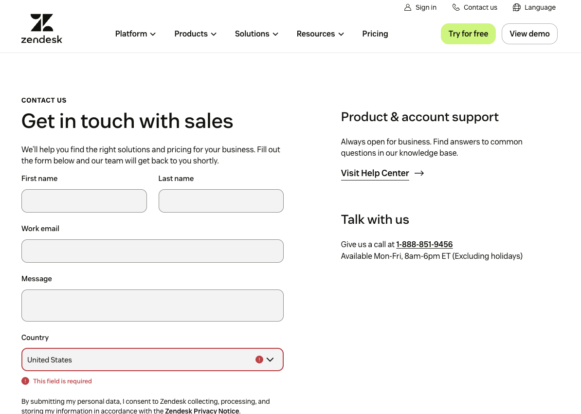
Although the Contact Us page is not typically a user’s first stop on your website, they venture to that page during a critical moment in their journey with your company (interest in becoming a customer, partner, employee, etc.) It’s worth the time to align this key page with the rest of your company’s brand identity.
Zendesk is also a great example of a simple and straightforward web form. To enhance user experience and encourage action, businesses should adopt a minimalist design approach for their contact page, like Zendesk. A clean and visually appealing interface fosters professionalism and trust, increasing the likelihood of form engagement and completion.

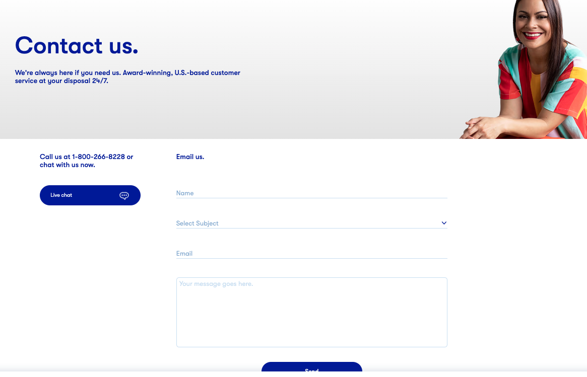
1-800 Contacts
1-800 Contacts are known for their award-winning customer experience — their contact info is in the company name after all! They offer multiple ways for users to get in touch with the business (by phone, live chat, email, and form).
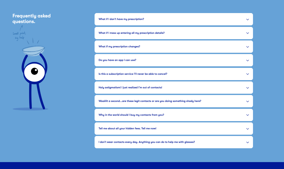
They take their contact page one step further by including a “frequently asked questions” section that uses a witty tone as if you were texting your friend. “Holy astigmatism! I just realized I’m out of contacts!” is our favorite. The only thing missing from this page is a contact (lens) pun.
Beyond Meat
Beyond Meat’s Contact Us page does a wonderful job of laying out multiple contact options based on inquiry type. Once an option is selected, it’s effortless for a user to navigate back to the Contact Us overview page if they made the wrong selection.
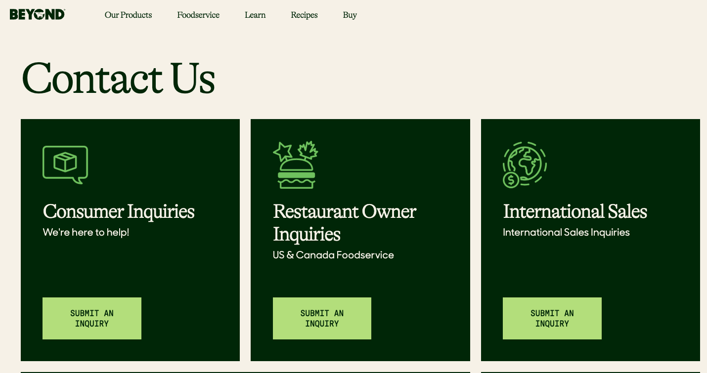
The layout of the page aligns nicely with the branding across the rest of the website but they’ve kept this page simple by eliminating design elements like images, videos, and layouts that break the grid to allow users to access this information quickly.
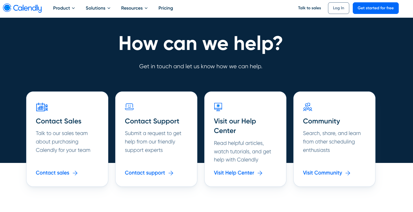
Calendly
It’s no surprise that Calendly’s contact page makes it easy to get in touch with their company since they’re a scheduling automation platform focused on simplifying scheduling. Their Contact Us page routes users to five primary pathways depending on their needs and they prioritize customer-first paths (sales, support, and media) over partner-first paths (join our team and become a partner).
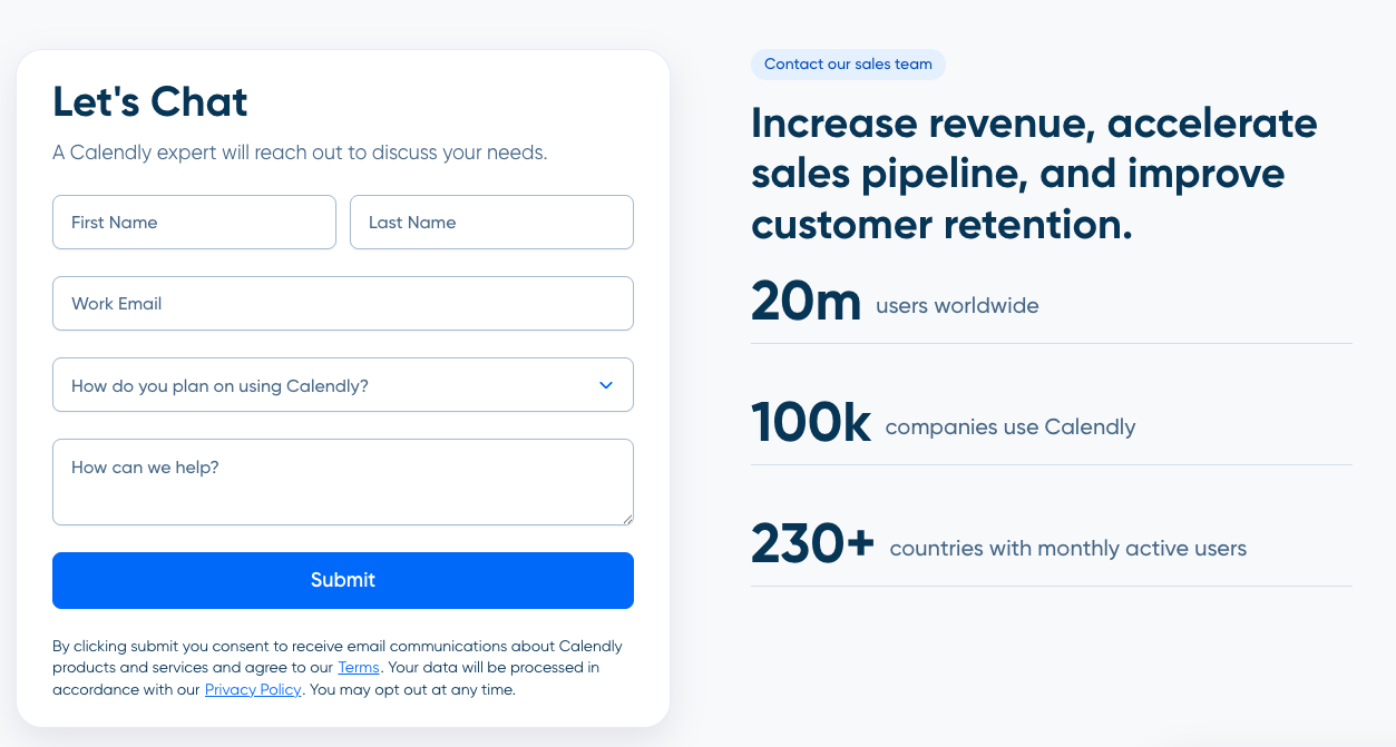
Their Talk to Sales landing page follows landing page best practices with a clear headline, form above the fold, and external validation. One opportunity for improvement is routing users to a more useful Thank You page once they’ve converted which includes additional opportunities to explore their product.
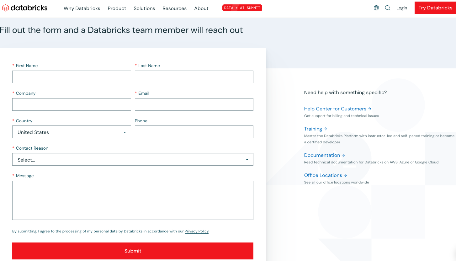
Databricks
Databrick’s desktop website includes an uncommon right-fixed navigation which is also featured on the Contact Us page. Databricks allows users to get in touch in multiple ways. The quick links on the right side of the page offer clear next steps for users who are looking for documentation, community, training, support, locations, and knowledge base. Once a user submits a form, they’re routed to a succinct Thank You page. In order to improve this experience, we recommend adding a few next steps links so a user can keep exploring.
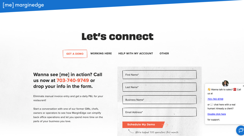
Marginedge
Marginedge’s Contact Us page takes a minimalistic approach compared to the rest of the website but it’s unique in that it features the contact button in the utility navigation so it’s always accessible and it leverages tabbed functionality for a user to self-select their interest (get a demo, working here, other).
Supermetrics
Supermetrics does a super job of laying out its Contact Us page. Users can select the contact card that’s most applicable (sales, customer services, job opportunities, etc.) and they’re routed to the form or website page most applicable to their inquiry.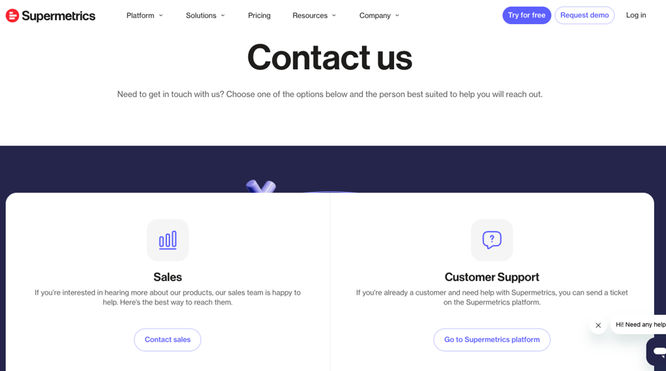
Sharetru
After undergoing a top-to-bottom rebrand, Sharetru, an enterprise file transfer software, took a vibrant and sleek approach to UX across the new website. Their Contact Us page mirrors the same user-friendly interface, offering multiple options for contacting sales, billing, and support teams.
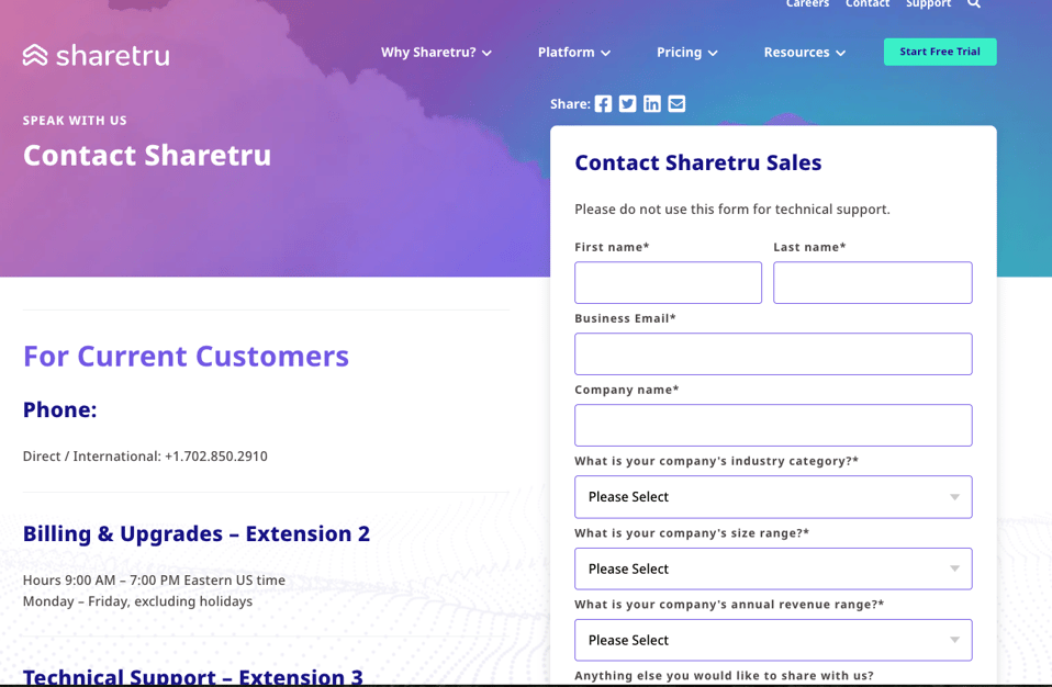
The page also offers pathways for current and new customers, allowing users to get to the right representative according to their status and specific need for contact. By segmenting the contact page accordingly, Sharetru saves users wait times and endless call transfers. 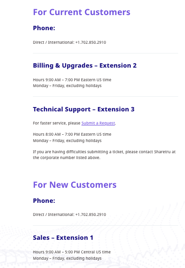
As a complement to the Contact Us page, Sharetru also includes a Support page with knowledge-base-style articles, plus a search bar, for easy technical resolution. There’s also an FAQ page and plenty of segmented resources as self-service options.
Sharetru implemented a “sticky search bar,” allowing users to navigate to any new section without needing to scroll back up on the page. The fade-away design and stark color contrast offer an ADA-compliant, engaging experience across the website.
How to build the best Contact Us Page for your product.
A Contact Us page should be one of the many ways a user can get in touch with your business. While these pages should enable any user to get in touch, we recommend encouraging primary user groups such as prospects and job seekers to get to the contact pages that are MOST relevant for them instead of the generic page.
- Make it easy to find. We recommend featuring your primary BOFU call-to-action in the main navigation (for example, “request a demo”) and housing your contact page in the footer.
- Use historical data to inform content strategy. Are you seeing the same repeat questions or inquiries come through your contact page that a website page or FAQ can solve? If so, use that to your advantage and create additional pages to solve a consistent user query that doesn’t require a form fill.
- Be intentional about your form strategy. Asking the right questions empowers your internal stakeholders to have all the information they need to support the user who reached out. Tailor your forms based on the information internal stakeholders need to know.
- Set up automation to ensure a timely response to inquiries. According to Forbes, only 27% of leads ever get contacted. Your Contact Us page content strategy, design, and placement are all irrelevant unless you’ve set up your CRM to notify team members when a contact inquiry has come through.
Here are more tips you should center your landing page around:
Consider buyer personas when designing the Contact Us page.
When designing a Contact Us page, businesses should consider their buyer personas by including features and resources that are specifically tailored to their customers' needs. Thoroughly analyze your buyer personas and include relevant support options and information on the page, making it easier for visitors to find the assistance they require. Here are some tips for making your page persona-centric:
- Know the common pain points or questions that customers may have. By acknowledging and addressing these concerns on the Contact Us page, you have the opportunity to provide valuable support options that directly target these pain points. This may involve offering detailed troubleshooting guides, comprehensive FAQ sections, or easily accessible self-help resources that cater to the specific needs and preferences of different buyer personas.
- Understanding customer preferences and communication channels. For instance, some buyer personas might prefer phone support, while others may prefer live chat or email. By including multiple support channels that align with the respective preferences, businesses can cater to the communication style of individual personas and ensure a seamless experience.
- Include resources such as office locations, regional contact numbers, or multiple language support. Businesses can take into account the geographic distribution of their customer base and provide relevant information or localized options accordingly.
Avoid unnecessary fields and words on the Contact Us page.
To create a seamless and user-friendly Contact Us page, carefully assess the necessity of each form field. By including only essential fields that are relevant to the purpose of the page, you can streamline the process and enhance user experience. Here are more tips for a clean page:
- Keep the page straightforward and concise. This means avoiding the use of superfluous wording or excessive explanations. Providing clear instructions and using simple language can help users quickly understand what's expected and how to complete the form efficiently.
- Consider the impact of mobile browsing when designing contact forms. As the number of users accessing websites on their mobile devices continues to rise, make sure to optimize contact forms for smaller screens. By keeping the form concise and removing any unnecessary fields, mobile users can easily navigate and complete the form without any frustrations.
- Regularly review and update the contact form. This allows you to continuously assess the relevance of each field and remove any that are no longer necessary.
Showcase your thought leadership on the Contact Us page.
To effectively demonstrate their thought leadership on their Contact Us page, businesses can employ several strategies:
- Include a dedicated section that highlights recent blog posts or articles. By showcasing your industry knowledge, insights, and expertise, you provide visitors with valuable information and a glimpse into the company's position as a thought leader.
- Feature testimonials or case studies from satisfied clients. These testimonials can specifically highlight how the company's insights and strategies have positively impacted clients' businesses.
- Display relevant awards, certifications, or recognition received by the company. These achievements showcase the industry's acknowledgment and solidify the company's position as a frontrunner in the field, elevating your trustworthiness.
- Integrate social media feeds. By showcasing recent posts, conversations, or articles shared on various social media platforms, you can exhibit ongoing engagement with your audience and demonstrate your consistent thought leadership across different channels.
- Include a section that specifically outlines the company's research and development initiatives, innovation projects, or contributions to industry publications to effectively highlight your commitment to pushing boundaries and driving thought leadership in the field.
How to optimize your Contact Us pages for higher conversions.
By implementing conversion rate optimization strategies, you can create Contact Us pages that not only cater to mobile users but also enhance the overall user experience, ultimately increasing conversions and customer engagement. Other tips to improve you website's CRO include:
- Prioritize mobile-friendliness. This entails streamlining navigation, utilizing concise forms, and integrating clickable CTA buttons. By optimizing your page for mobile devices, users can effortlessly complete forms without any hassle.
- Prioritize responsive design. Ensure your pages seamlessly adapt to various screen sizes and devices by implementing fluid layouts and responsive elements. This includes incorporating adjustable form fields and easily readable text that automatically adjusts to fit any screen.
- Clear and concise messaging should be a priority. By providing succinct instructions and guidance, you can minimize user confusion and encourage more engagement. Including relevant information, such as the purpose of the form and expected response time, can also help set appropriate expectations.
- Consider the use of visuals to enhance the page. Utilizing icons, images, or videos can make the page more visually appealing and engaging, thereby increasing the chances of conversion.
- Ensure effective placement of contact details. You should make sure that their contact information is easily accessible and prominent on the page. Include multiple contact options, such as phone numbers, email addresses, and social media links, can cater to different preferences and convenience for users.